These two pie charts are based on the latest information, but there are probably some data errors.
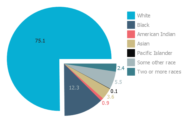
The first chart shows the present population breakdown by race and it's percentage of the whole.
At present, the White race is still the majority by a 3 to 1 ratio.
Judging from the media, you would get the exact opposite impression. When is the last you saw a commercial featuring a married all-White family? With happy children?
Where the man is straight? That the couple isn't interracial? Where the Negro woman was smart and the epitome of beauty?
The indoctrination extends from the classroom to the TV set.
The second chart shows a projection of future demographics, assuming present trends continue.
von Koehler